
Colors are as important as they are complicated; this is an ideology that designers know all too well. Whether you are sketching up roughs for your friends’ garage band this weekend or editing photos pixel-by-pixel for your portfolio that you’ll submit to Google; using color correctly is paramount. You can always tell a designer from a non-designer based on how you describe the color of something- but why is it so important? Let’s dive in.
It [color] has a vast array of functions ranging from how something makes you feel all the way to recognizing a brand element. However, where you see something makes all the difference. That’s not to say that a McDonald’s in Pittsburgh, Pennsylvania will look different than one in Madrid, Spain- but that is a perfect segway into the question of “How would the arches be exactly the same yellow?” Now that… is a good question.
Perfection with Pantone Matching System
This is where color takes on much more complexity than saying yellow or thinking that calling it cardinal yellow makes any difference. Something called the Pantone Matching System or, PMS for short comes into play.
In short, the Pantone Matching System is a universal language of colors that enables color-critical decisions to be made on behalf of brands and manufacturers. I may or may not have pulled that description right off of their website. Regardless, it takes color to the next level. Instead of calling out the cardinal yellow that was mentioned earlier- we would instead say that the arches are Pantone 123C.

“Why does it matter?”
It matters because no matter where McDonald’s would go to make their signs – they will all look exactly the same! The reason is that every manufacturer will have the exact same CMYK combination of 0:100:91:0 that it takes to make PMS 123C.
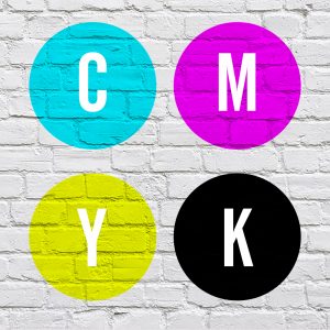
“What is CMYK?”
It seems we may have skipped a step…
CMYK is the subtractive color model commonly used in the printing process & stands for cyan, magenta, yellow, & black. Yes, the “K” stands for black which is a topic for another day. I also may or may not have taken this definition off of Google. In simple terms, CMYK is the color used to make up everything you see that is printed. The slightest change to any of the CMYK values can have a dramatic effect on print color.
So now we know that we can manipulate these four-color settings to print the CMYK equivalent of Pantone 123C. So, you might think that if McDonald’s would ask to put the arches on their website we would simply take the CMYK values and put them on the screen; right?
Wrong. This is where color takes another turn in complexity. CMYK is a print process, however, our screens utilize a different spectrum of color. They use RGB.
Understanding RGB
RGB, as Google describes it, is an additive color model used for screens & displays. RGB stands for the three primary additive colors: Red, Green, and Blue (no tricks on this one).
Knowing this, we would have to convert our current understanding of the CMYK & Pantone yellow that McDonald’s wants into an equivalent screen color. Which, if we go online and look up Pantone 123C we are given another color breakdown, just for screens! 255:199:44 which are the values for RGB.
Color is complex, constantly having to dash between CMYK, Pantone, and RGB is sometimes required. Bigger brands with set colors are the ones that will be the most critical of this. If you are starting with someone who doesn’t know too much about the color though, make one small recommendation to remove worlds of headache from their future. Pick the colors you want in CMYK first, and then convert them into RGB.
“Why would you do CMYK first and not RGB?”
The reasoning behind that is color space- or rather the size of the color space. All CMYK colors can be represented by RGB, but not all RGB can be represented by CMYK. The reason behind that is because the RGB color space is much larger (see below.) Now that you know three main color spaces in the physical design process; we can touch base on why we would use certain colors.
Building the Best Brand
Colors play a huge role in marketing today, particularly branding. The reason behind this is because colors have subconscious meaning behind them. For example, a few hundred years ago purple represented high-class society. This association was made because purple was only worn by the kings and queens who had the money to produce such a magnificent color. Even today some people can associate purple to luxury.
It’s important to pick out the right color for your brand to relay the correct message to customers. Colors are also a way for companies to express themselves nonverbally, to stand out from their competition. Some brands struggle with choosing powerful color schemes for their brand that can oftentimes give the wrong message. A fun way to pick out your brand colors is to experiment with Adobes Color Wheel.
I hope that this has made color seem a little less confusing, but maybe it’s made things even worse. It may not be your job to make color decisions but knowing even some of these basics can save you or your company lots (and lots) of money in the long run. Even simply knowing to question something is important.
Here’s my plug- if color is still confusing to you after this and you are working with Butler Technologies, Inc. on a project; please feel free to ask, or check out our graphics page to learn more. We have dozens of very qualified, friendly professionals who have years of experience with this subject in particular ready to help. When you’re ready, Contact Us.