When designing a product or reproducing one that already exists, there are plenty of important decisions and processes involved. Chances are if it has a graphic overlay or includes a label, it’s going to have colors. It may be as simple as black text on a white background, or as complicated as 10 different colors. Whichever the case may be, chances are that the color will need to be matched.
Pantone Matching System
The printing industry works mostly with the Pantone Matching System or PMS colors. Pantone is a standardized color library used all over the world to communicate colors. When a customer designs a product, they generally “call out” the preferred PMS colors for their product. Whether it is digitally printed, or screen printed – these colors must be matched to the customer’s specifications – and when it comes to matching colors there can be some challenges and other things to consider when both choosing a color pallet, and when printing it.
What affects matching colors?
The Process (screen or digital), the material, and the lighting environment in which the product will be viewed are all important things that affect matching colors.
1. The Process
Some things that affect the outcome of color in screen printing specifically are things like the screen mesh count, mesh type, squeegee sharpness, angle, pressure, and even curing temp and time it takes to cure. Screen printing can achieve colors that digital can’t, such as bright colors like fluorescents, and metallic or chrome. These are things to consider when choosing the process. Because Digital makes all colors with CMYK, or the “Four Color Process” (Cyan, Magenta, Yellow, and Black), some colors can be difficult to achieve. While Digital has its benefits, it also has its drawbacks, and one of those is lack of intensity in some colors. Think of digital print like your home computer printer, it achieves colors by a blending of dots.
Here is an example of how the same color can appear different depending on the process and finish.
Coated = glossy
Uncoated = matte
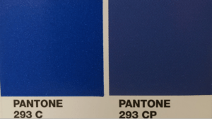
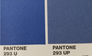
“293 C/U” is the Solid Coated / Uncoated and screenprint achievable variation of the color.
“293 CP” is The Coated Process Simulated / Uncoated Process (CMYK) and digital print achievable variation of the color.
As you can see, there is a slight variation between the appearance of all four versions of the same color and even more of a variation between the coated and uncoated.
2. The Material
This brings us to the next thing that can change how a color appears: the material.
Most of the materials used in making a graphic overlay or label are either Polycarbonate or Polyester. The print can be 1st Surface (the ink is applied to the top surface of the substrate, and readable from the top. We call this 1st surface right reading) or 2nd surface (Where the ink is applied to the backside of the material and the image is mirrored so that when the sheet is flipped the image is readable through, and protected by the material). We call this 2nd surface, wrong reading – this is how most graphic overlays are made.
When choosing a second surface print, it is important to consider the material type, thickness, and whether it is a matte, textured, or gloss material. Most “clear” materials have a natural color to them, and that is also something that is considered while matching. (If a material has a cast of yellow to it, then the image being printed will need to offset that with some extra blue). If the material is matte or textured it causes diffusion of light which in turn makes the color requested appear lighter.
When choosing a first surface print, the color of the ink is only impacted by the color of the material itself, and whether an overlaminate is applied to protect the ink or to alter its appearance. (If a matte overlaminate is applied to black ink, the same diffusion of light occurs as with matte or textured material on 2nd surface print, and the black in will appear more of a dark gray than black).
Since color is a property of light, what we see is the result of some colors being absorbed and others reflected. What is absorbed by an object is invisible to the human eye, and because of this, what may match very well under one lighting source, may look very different under another. The term for this phenomenon is called “metamerism”, and it occurs because there are differences in wavelengths of light when viewed under different lighting sources (fluorescent indoor lighting vs. outdoor lighting). This can also happen as a result of how ink is applied to the material. Two different digital printers could lay their ink drops down differently, and as a result, reflect light differently causing a visible shift in color.
3. The Lighting
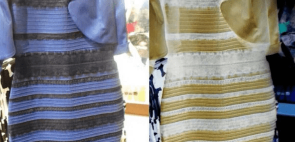
The last thing that really impacts color matching is the light the product will be viewed under indefinitely. A good example of how lighting affects color is the whole dress debate that happened a few years ago: Is the dress pink and blue or gold and white?
Pantone has included at the very back of their swatch book a lighting indicator, as pictured below.
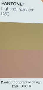
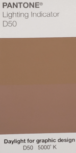
You can see how much it varies between two lighting sources.
Because of this, it is very important to know what the product will be lighted by. If the lighting source is unspecified, the colors are usually matched under “cool white” or “store” in a light booth, to provided color consistency through runs for the same product line, or customer.
At Butler Technologies, we understand what it takes to “color match” your product. We have a dedicated team of employees ready to help you every step of the way. Reach out to discuss your next project, we’ll be happy to help!
 Meet The Author: Anne Feldbauer
Anne is our Digital Print Department Manager at BTI. She has worked at Butler Technologies since she was 15 (that’s 14 years!). In her free time, she likes to draw, crochet, and collect rocks from all the places that she has visited. She loves animals and has a furbaby (cat) named Sabre.